Basement Reno Update & Finding our Bathroom Style
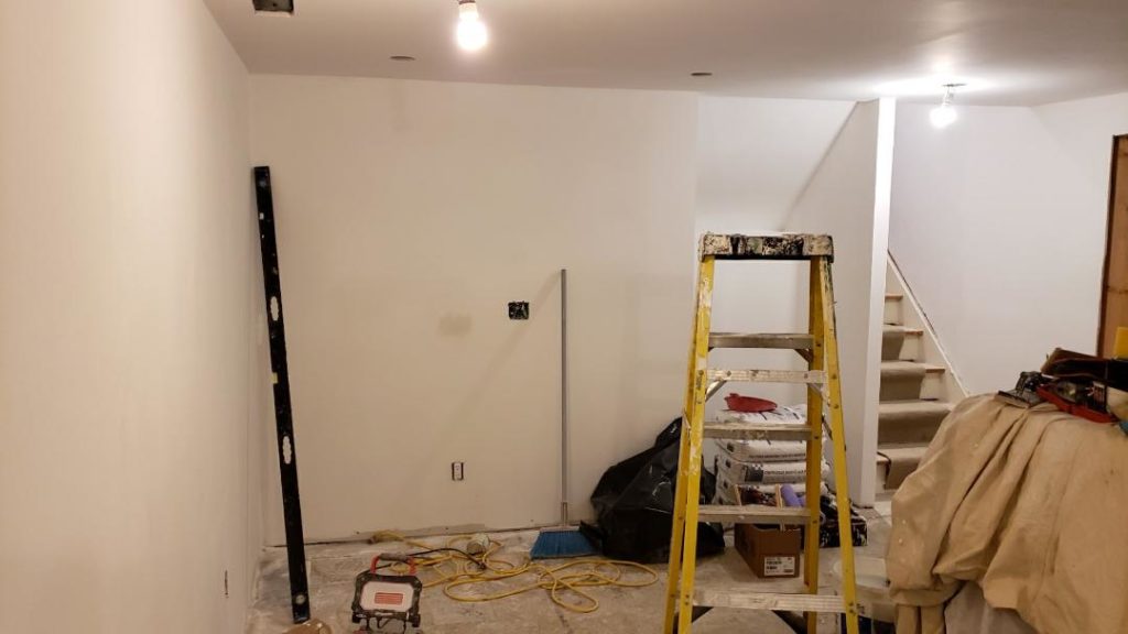
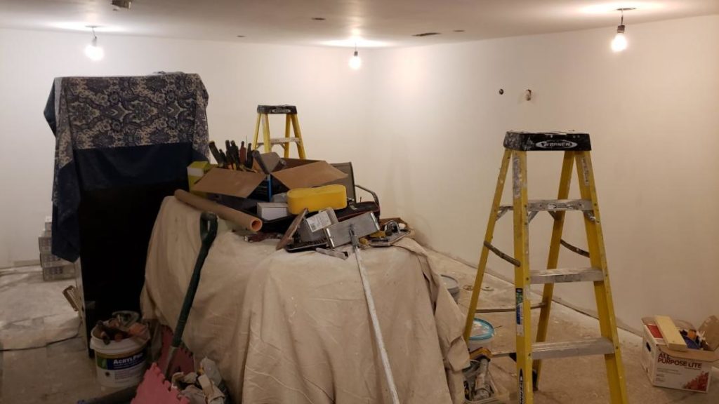
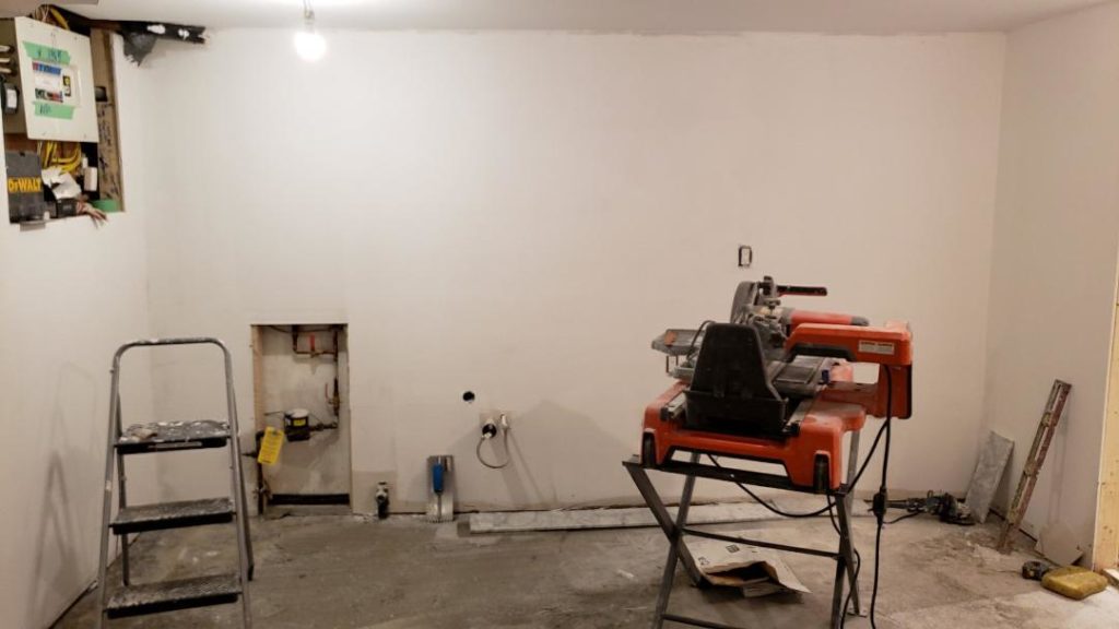
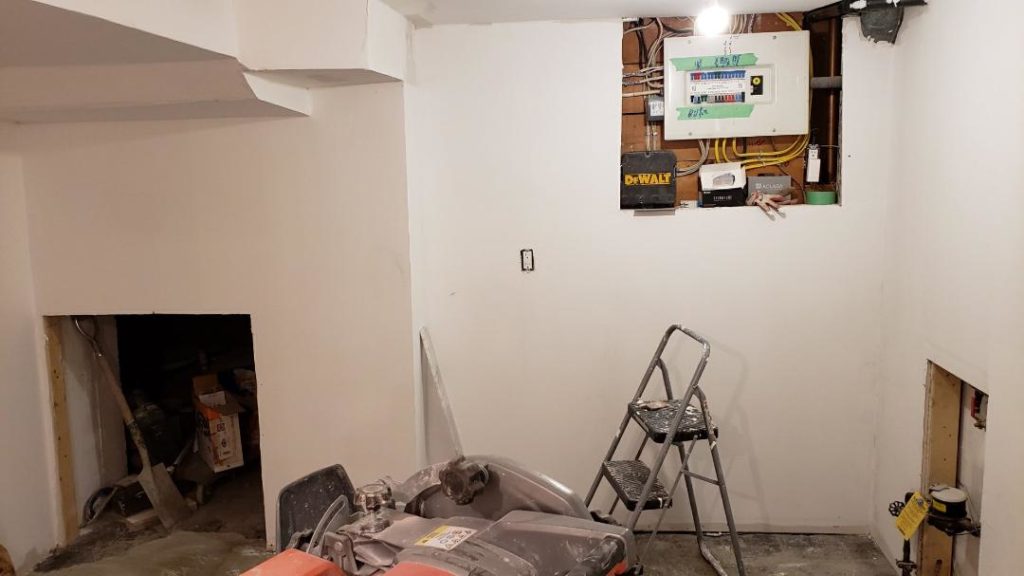
Hey everyone! We’ve already finished four weeks of our basement renos and now that all the structural work has been done we are really starting to see progress. Just last week the basement looked like a disaster – cement and dust everywhere as we leveled out the floor. Looking at it I thought we’d be in a mess for at least a couple more months! But now that that part is over I almost feel like saying we’re in the home stretch but I know we still have a ways to go!
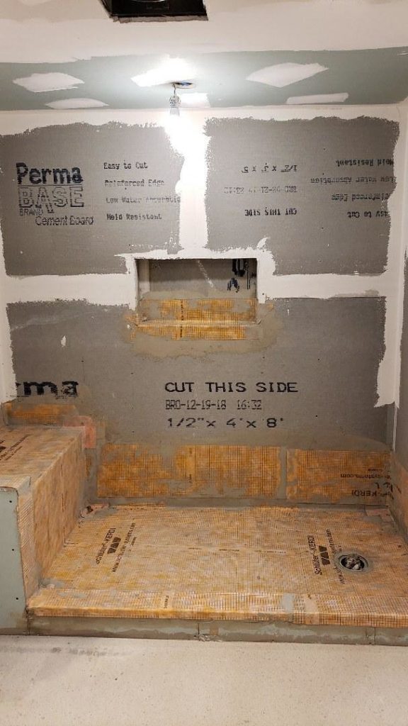
Today they primed all the walls in the entire basement and they actually started tiling the new bathroom! I’m actually so excited to start seeing our ideas come to life!!
But of course no reno story is complete without a little drama and turmoil! You all know how much I love a good war…I can’t help myself ever since Sunday, I’ve got Game of Thrones on the mind! Who do you think will win the throne? Ok, too excited – I digress!
Back to the reno wars that we had in our house between me and the hubby! And it was all over a tiny new bathroom we never even had to begin with! It was the battle over design styles!! And we didn’t have two to pick from, that would have been too easy. We had landed on four different styles and we couldn’t agree on which one to go with!
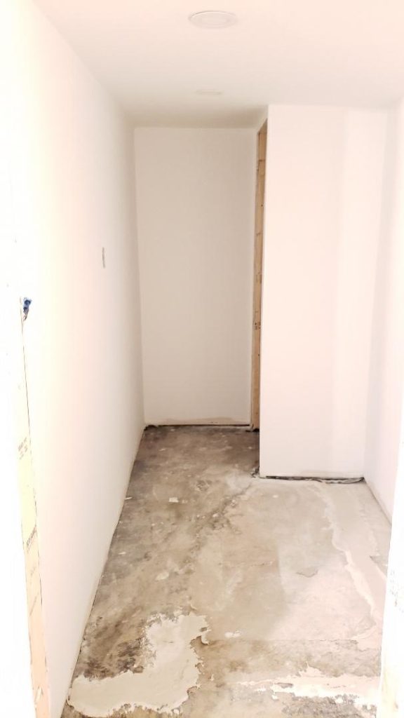
So before I show you which style we landed on, here are a few pics of what the basement is looking like now!
And here are a few of our inspiration pictures of the different bathroom design styles what we were battling over…I mean had to choose from! We’re passionate people in this house!
Modern Farmhouse
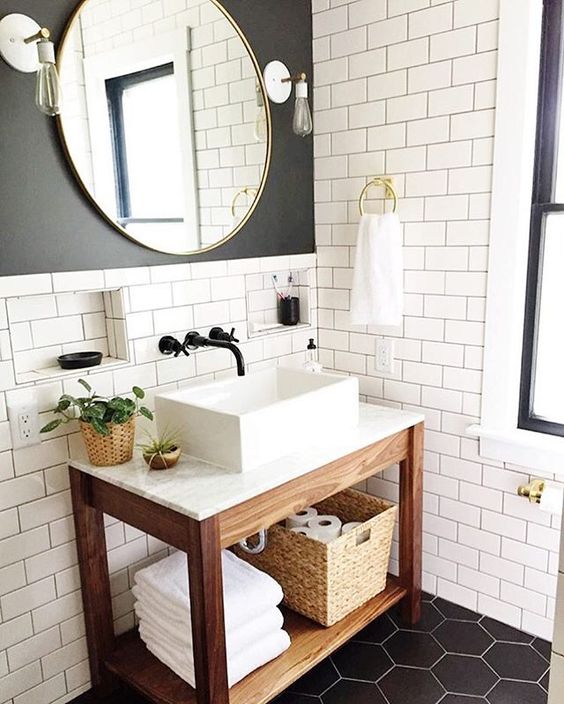
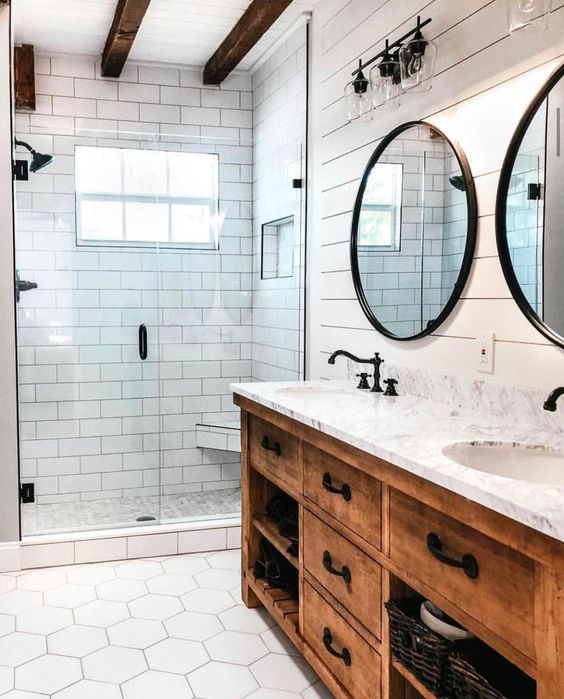
When I started going through my recent pins I realized that I was really drawn to the warmth of the Modern Farmhouse style. The warmer neutral colours, wood, simplicity of subway tiles and iron fixtures together felt cozy and calm – two things I want in a bathroom.
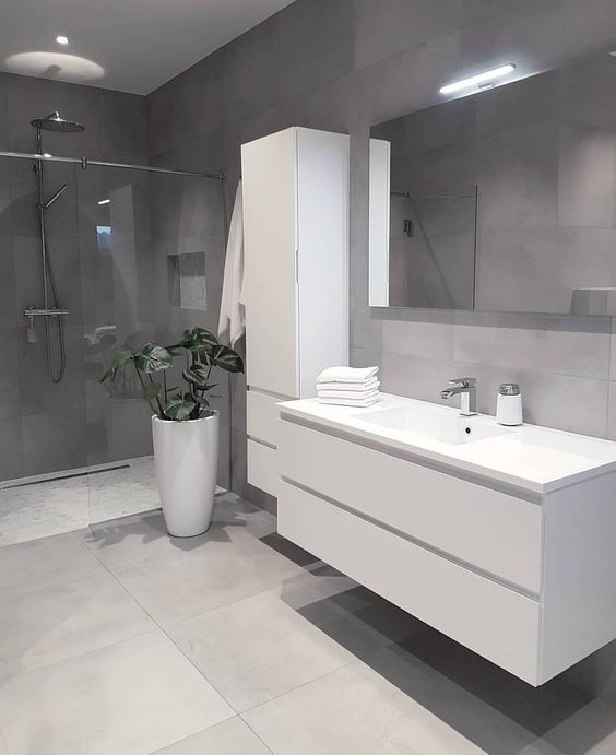
Uber Modern
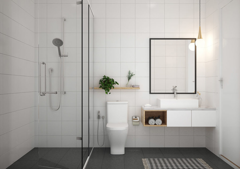
My husband was on the other end of the design spectrum – he wanted an uber modern bathroom with cool crisp colours like white and grey, clean sleek lines, floating vanities and chrome finishes throughout. So when he saw my idea of a modern farmhouse bathroom you can imagine the battle that ensued!
Transitional Classic
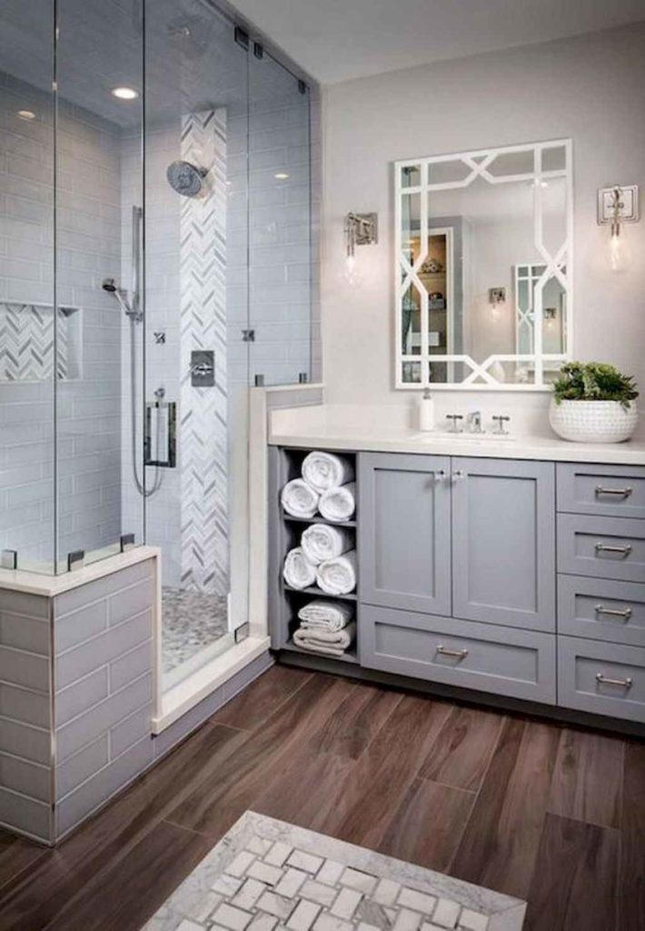
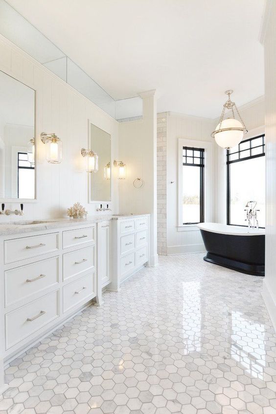
It was interesting because he was all about modern design in everything he liked in the magazines and online. Then I took him to a couple showrooms to start looking at fixtures and rooms in real life and he pretty quickly changed his mind. He was no longer crazy about the modern designs and was actually leaning towards more of a transitional look, which is kind of between contemporary and classic. Most see this as a bit of a happy medium. He really liked the look of a white or grey vanity – it was still crisp and clean but also had some luxurious elements like marble too.
Mid-Century Modern
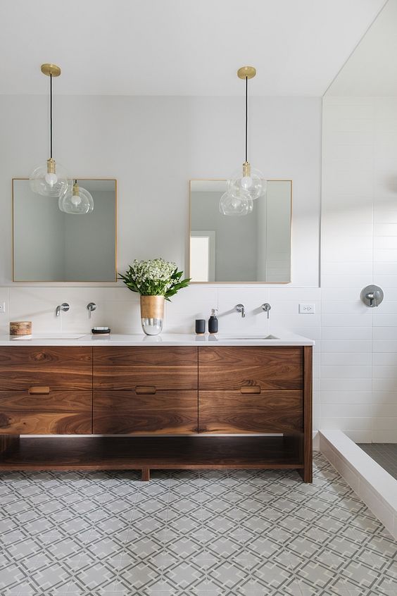
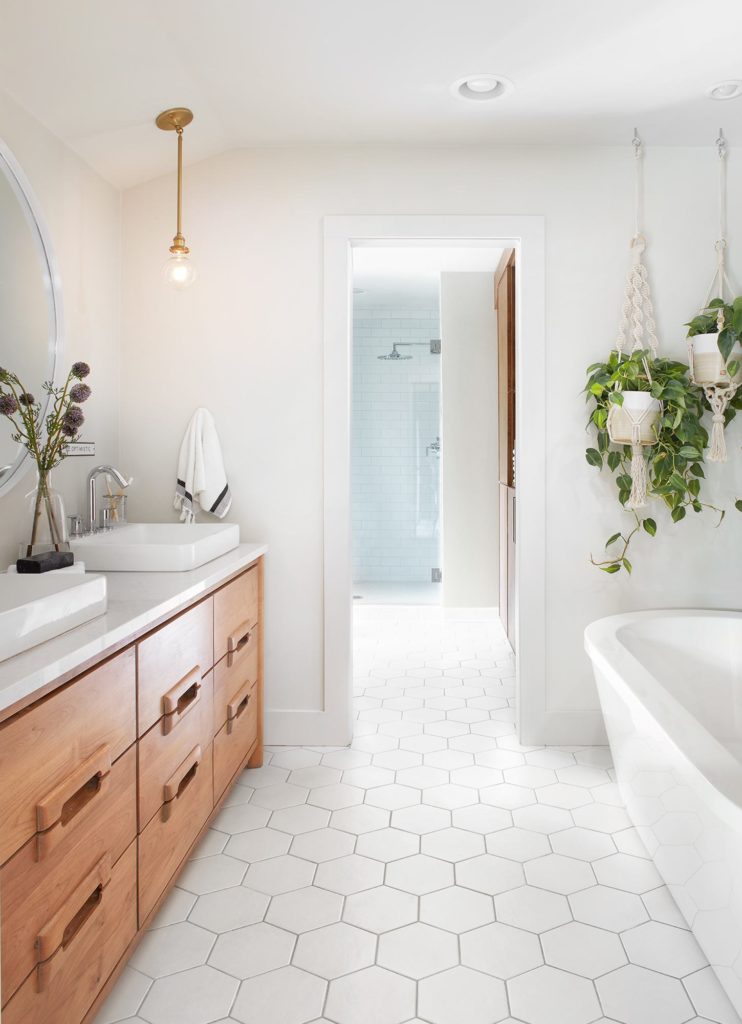
And when I looked through some more of my inspiration pictures and even through the showrooms we visited, I stumbled upon the Mid-Century Modern bathroom design. It incorporates clean lines, geometric patterns, wood, but also has a focus on different metals like gold and on the use of lighting in geometric shapes.

Our Bathroom Design
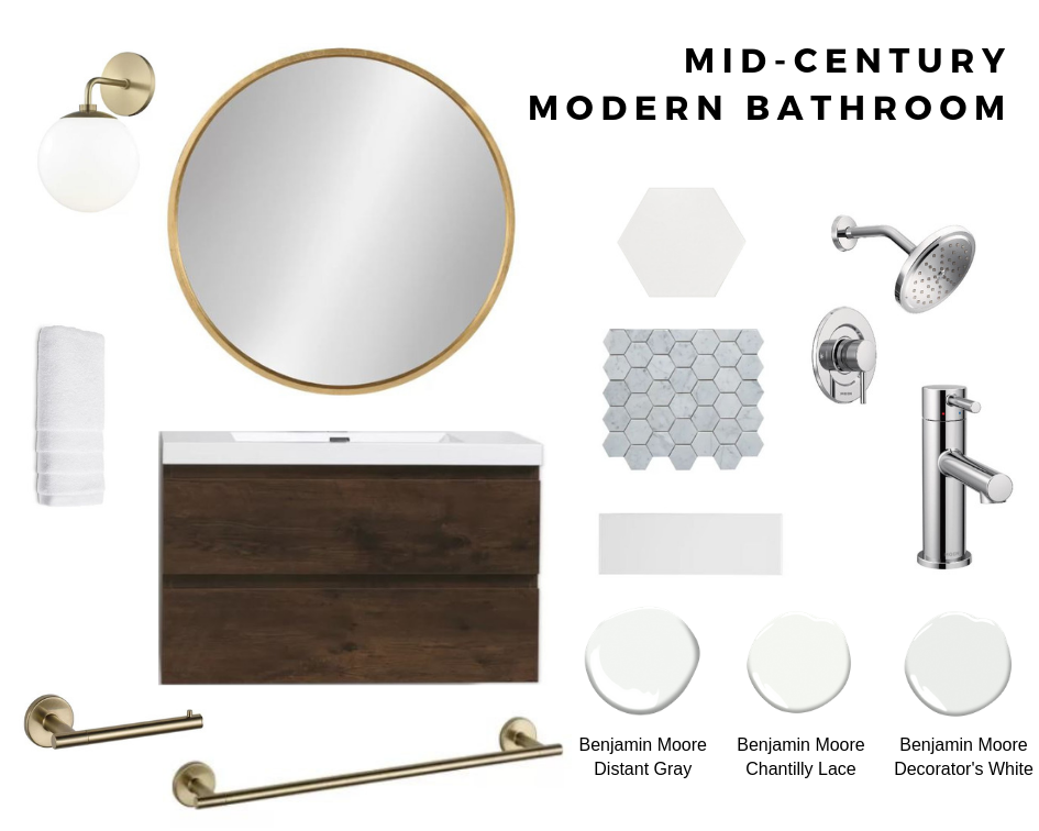
We found that by combining some of our favourite elements of each of the styles we had liked we were able to create our very own version of a Mid-Century Modern bathroom design that we both loved. Check out the design board below of the elements we’re using in our bathroom to complete our look.
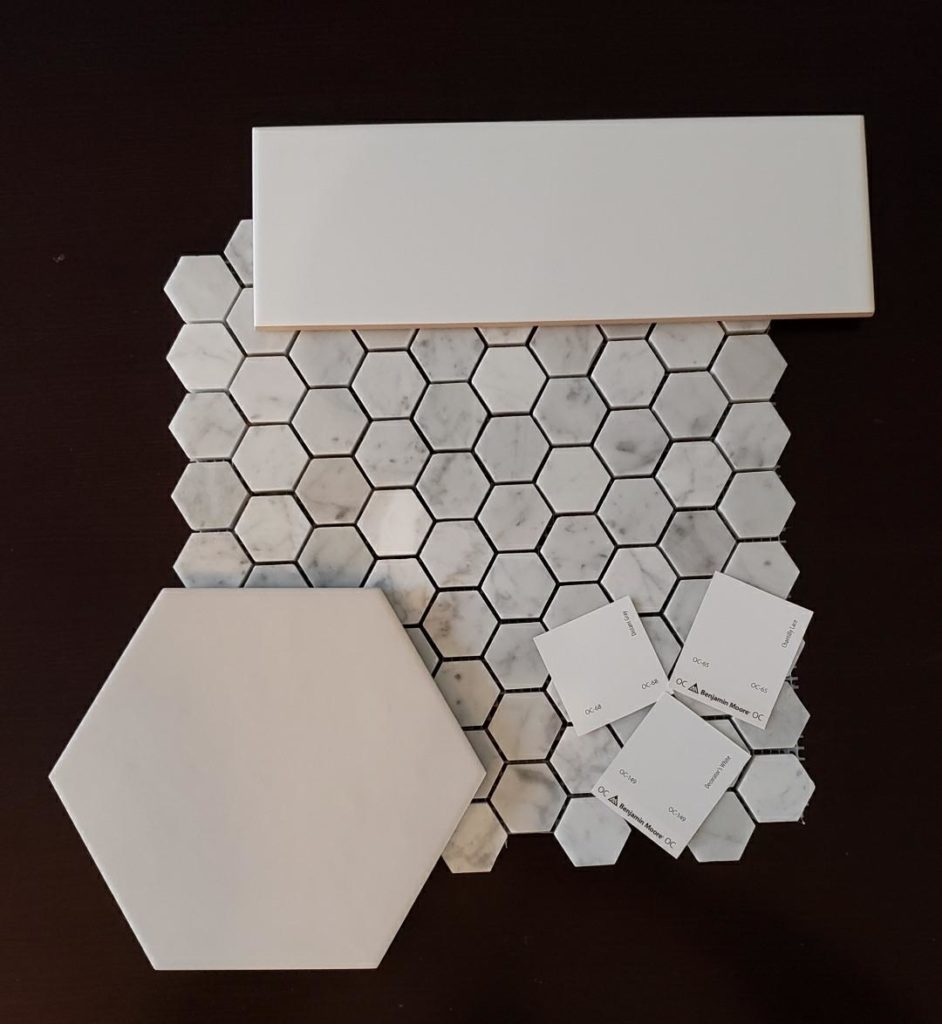
The first thing I picked out for the bathroom was the Centura white hexagon matte floor tile. I fell in love with it as soon as I saw it online and tracked it down at the Tile Store for those of you in Toronto. I also knew that to really make the geometric pattern pop I was going to pair it with a light grey grout. Using those two colours as my starting point really helped me pick out our other tiles and paint.
We decided on a simple white matte subway tile for the shower walls but to add a bit more of the modern to it we went with a longer 4’x12” tile. And keeping with the hexagon pattern and wanting to add a little luxe to the room, we decided on a 1.25” Carrera Marble Honed Hexagon tile for the shower floor and the shower shelf. It’s a bit pricier but since it’s not for a large space we were willing to splurge a bit and add that bit of luxury feel with the marble. Plus I am just really loving the hexagon pattern!
We landed on a cool crisp colour palette using Benjamin Moore Aura Bath and Spa paints for the bathroom. We decided on Distant Gray (OC-68) for the walls, Chantilly Lace (OC-65) for the ceiling and Decorator’s White (OC-149) for a nice bright pop on the door and trim.
The Vanity and the bathroom fixtures were a bit of a struggle. He really wanted to stick to something modern and I wanted wood. We landed in the middle with a wall-mounted rosewood vanity. We actually found it on Wayfair which really surprised me at the great selection they had. The other part of the battle was convincing him that we didn’t need to have chrome fixtures and accessories – he’s a bit traditional in that way! We ended up compromising and doing chrome bath fixtures but then I got my way with a gold round mirror, gold globe shaped sconces, and gold accessories. He’s been hesitant but I keep telling him to trust me, it’s ok to mix metals!
Anyhow, that’s the bathroom plan! I’m so excited to see it all come to life over the next couple of weeks!! Stay tuned for more updates on our basement reno. And I’d love to hear what you think so far!



2 Comments
Ellen E
I love you choices! Also the process you went through to get to your final decision. Good job!
Tammy
Thanks! I’m so excited to show you the final bathroom!