Basement Family Room Inspiration
Hey there! And happy Friday! Who else is ready for the weekend? Why does it always feel like the short weeks are the longest!!? We’ve got another jam packed weekend ahead but hoping to get some stuff done around the house too! Fun stuff though like furniture shopping and getting started on some DIY projects too!
For those of you following our basement renovation, we are really getting there! Laundry room cabinets arrived last week and they are almost fully installed. Just the finishing touches like the sink, countertops and backsplash and we are done. Ok those are big – let’s say two more weeks to go!
In the meantime, I’ve been keeping busy with designing the Basement Family Room, or what the hubby is making into a ginormous Media room…I think this one will have to be a bit of a compromise!
I would love to say that it all started with a dream, but I’d be lying. It actually all started with a door. Every designer will tell you that all beautiful designs start with a “jumping off point”. In other words something that inspired the rest of the design. For many it is a fabric, a pattern, a rug or a piece of art. For me it was a beautiful black chevron barn door. A door that only exists on Pinterest. I can’t find it anywhere and to have it custom made, well, I won’t even tell you what I was quoted! I’d have to sell my soul to the Door gods! But for those who know me, I will make it happen, oh yes I will! So my hubby (who I will say is kinda handy) has agreed to make me my dream door! It’s his new project and if he get’s cracking, it’ll be my anniversary present for next month. I’ll say it again, you’d be surprised with the things that’ll make me happy!
![]()
So as he’s figuring out the door situation let me tell you a bit about the basement family room design …not the whole thing, still working on the details so you’ll need to wait for that! I’m all about the details and I knew our design would have lots of fun playful patterns, inspired by chevrons and my new obsession with herringbone!
To start, we wanted to pick a colour palette that was neutral so that we could inject life and personality into the room through the finishes, fabrics and artwork. We landed on a couple shades of grey accented with navy blue, a crisp white, and of course black, starting with that beautiful door!
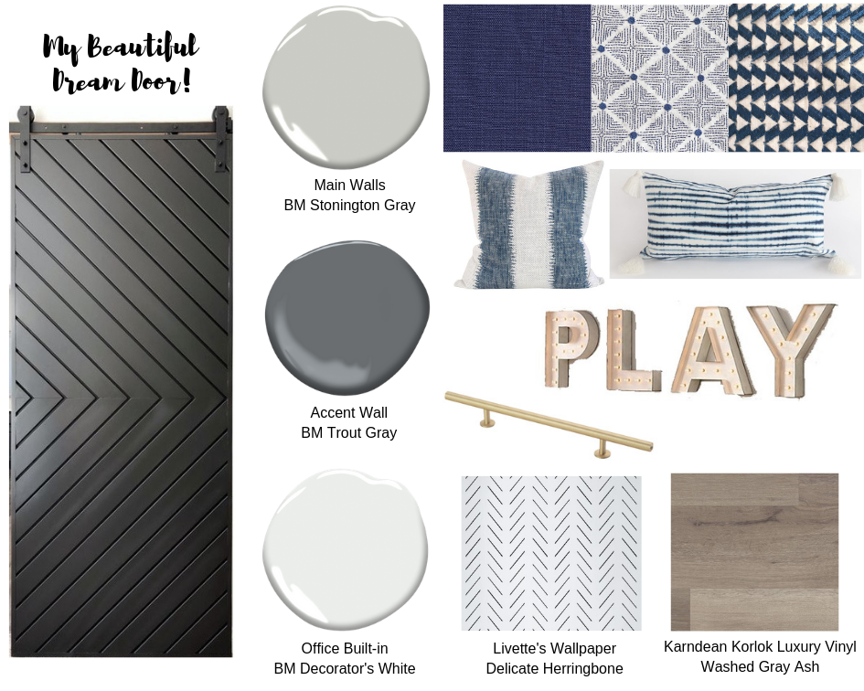
For the paint we landed on Benjamin Moore’s Stonington Gray for the majority of the space. It’s a nice light to medium gray without a lot of undertones. Since we were going to be mounting a large 75” TV on one of the walls I decided to make that an accent wall and paint it a darker grey. I landed on Benjamin Moore’s Trout Gray, a nice deep gray that would allow the TV to blend into the wall vs. looking like an eye sore. And the colours look so good together! We also decided on Benjamin Moore’s Decorator’s White for the Office Nook Built-In. It’s a nice crisp white that compliments the greys in the room and works will with the flooring too.
Speaking of flooring, we decided on a luxury vinyl floor in a White Gray Ash colour. It’s a nice gray that works really well with the colour palette we chose and the look of wood adds warmth to the room.
Veering a bit away from my usual safe choices, I decided to use gold and brass as my metals in this room. I usually play it safe with chrome and stainless steel, so I’m living on the wild side a bit here!
And continuing to play on the use of patterns in the space was like taking a geometry class! No test please! The chevron and herringbone patterns are used again for continuity in the fabrics for pillows and throws, in the delicate Herringbone wallpaper for the office wall, and even the rug which I think I may have finally landed on!
What I love about this colour palette and the overall design scheme is that it is neutral enough that I can easily switch things up! While I may be using Navy Blue as my main accent colour now, I can easily inject a new accent colour into the mix. How pretty and sophisticated would it look if I added in pink, or maybe a moody mauve? Or how about a pop of mustard to give it a mid-century mod look?
What do you guys think? Still need to buy furniture and lots of accents but I’m really liking the neutral yet playful design scheme we came up with! Until next time with more of the details!!