Laundry Room Reveal!
Hey everyone! How’s your summer going so far? You’ve probably noticed I haven’t been posting as much the last few weeks – sorry! With the kids out of school and at home with me they have definitely been keeping me busy! It’s actually hard to believe that our basement renos wrapped up a few weeks ago and I still haven’t posted any pics yet! My bad!
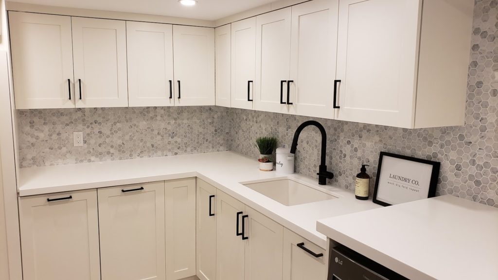
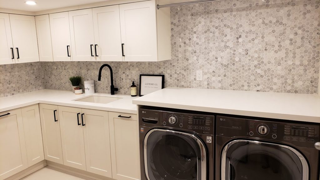
Since the kids were in camp last week, I was actually able to catch up on a few things. And I finally was able to take some pictures of the new space! First up, today I’m sharing our brand new beautiful laundry room with all of you! I think I’m inspired by all the laundry that piled up over another hectic weekend or honestly because this is where it all started for our renos. I wanted a new laundry room that is a clean, simple, pretty and functional space. And the final product honestly exceeded my expectations. I am so in love with it!
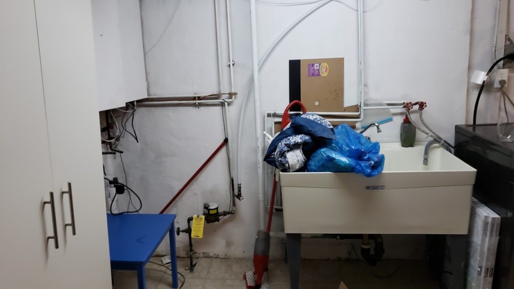
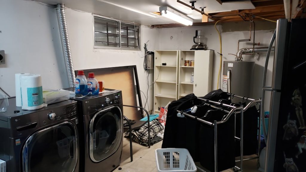
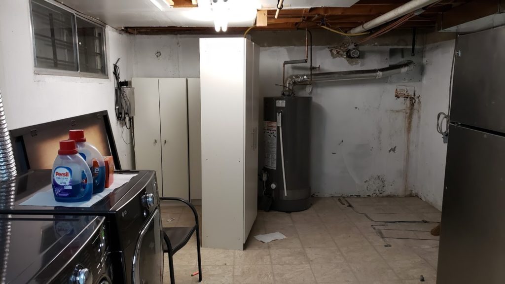
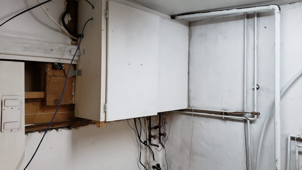
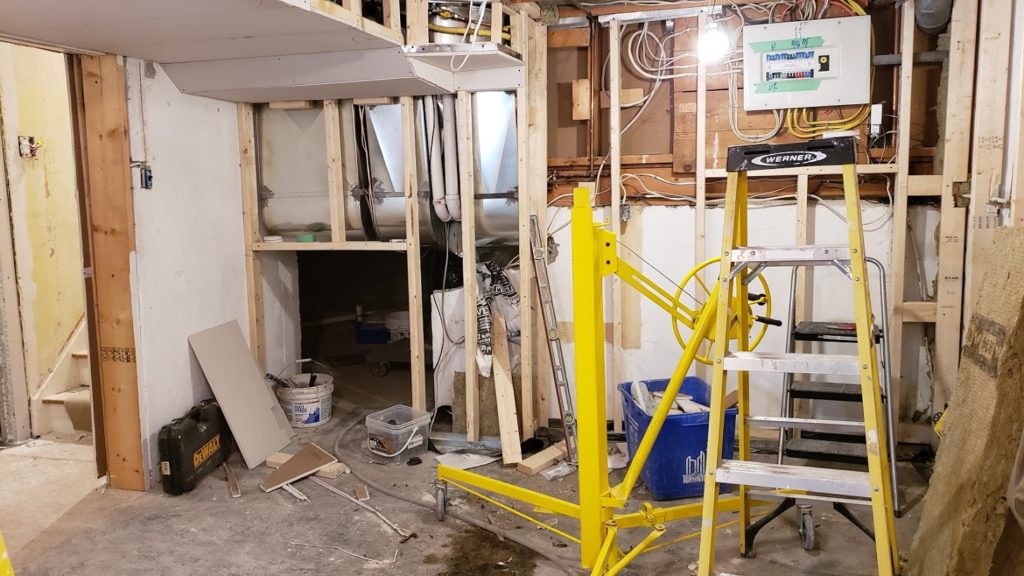
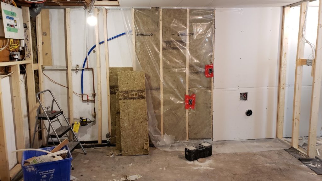
BEFORE: OUR DARK & DREARY LAUNDRY ROOM
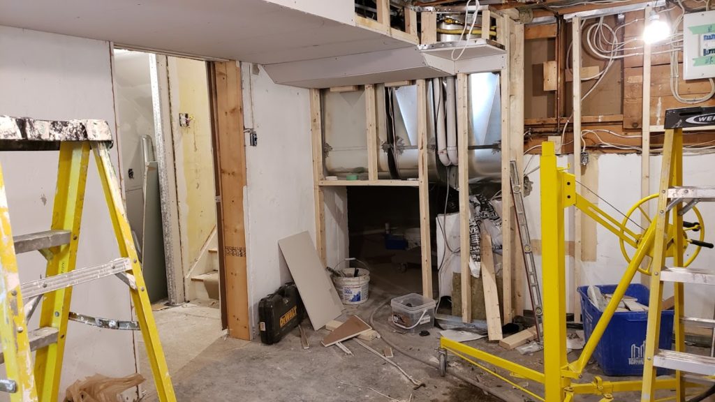
Before I share my brand new laundry room how about a little trip down nightmare lane to what we started with! Here’s what our laundry room looked like before and during the renovations! Gasp!
INSPIRED & FUNCTIONAL DESIGN
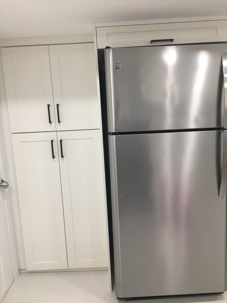
When we talked about a new laundry room the hubby left the design all to me. Smart man! His only request was that we have lots of hamper space. Done and check! But this renovation was going to be a lot more than just room for hampers! ANd that’s why space planning was so instrumental in making this a success. As I designed the floorplan and layout I made sure we would have lots of storage, an area for folding and hanging clothes as well as a pantry space including an area for an extra fridge. I love to entertain and we always need lots of fridge space!
To make this happen we needed to make some changes to the existing layout. When we drew it all out we realized that we had a pretty big laundry room at around 20’x11’ that also housed a monstrosity of a furnace and a gigantic water heater. We were also dealing with already low ceilings and huge ducts from the 60’s that spanned across the ceiling making them even lower. We knew that underpinning wasn’t an option because it would be too expensive. We went back to our planning and looked at our goals, priorities and wish list. We realized that if we left everything as is, we wouldn’t get the washroom we wanted or the additional storage we desperately needed. And we’d have to look at some ugly furnace, water heater and electrical panel right in the middle of our laundry room.
We ended up deciding to move the furnace into our crawl space. Our HVAC guy is beyond amazing – he hung the furnace on it’s side on the crawl space wall and even streamlined all of our ducts in the laundry room area giving us the much needed ceiling height. We also removed the gigantic water heater and had a new slimmer tankless water heater installed. While this may seem like huge change which it was, it gave us the extra space we were looking for. Instead of just having 2 rooms, we now have 4 rooms to work with: a laundry room, a new bathroom, new storage room and the family room. All with just 400 SF! Not bad space planning if I say so myself!
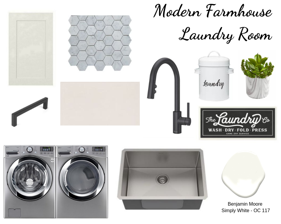
Now back to the Laundry Room! I landed on a Modern Farmhouse Laundry room design. I love the warmer neutral colours, shaker style cabinetry, simplicity of the design and black fixtures that together felt cozy, clean modern and calm – a lot of what we wanted in the space! Check out the design board below of the elements we used in our laundry room to complete our look.
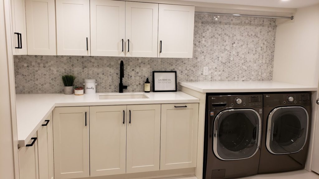
AFTER: OUR BRIGHT & PRETTY LAUNDRY ROOM
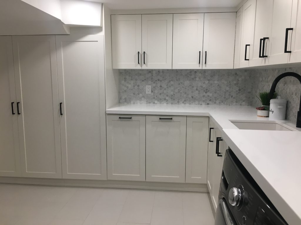
The first thing I picked out for the laundry room was a monochromatic warm colour palette using Benjamin Moore paint. I didn’t need to look at too many samples because right from the start I was really drawn to Simply White – OC 117. It is a nice soft warm white without any undertones and without being too creamy. To keep with the monochromatic look I decided to not only paint the walls this colour but to also use it for our cabinets.
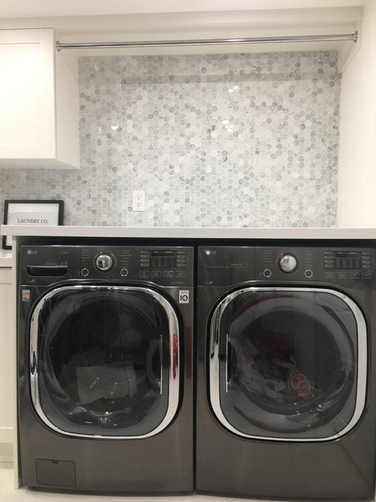
For the cabinets we went to my usual go to for custom cabinetry. I’ve used him for so many renovations that I’ve completed for family and friends, including their washrooms and kitchens, so I knew he would do a great job on my laundry room! We went with a classic shaker style door in Simply White. This cabinetry has been amazing. Not only did we get so much storage out of this design but we were also pretty smart in what we could also hide with it too. Hidden behind all those cabinet doors you can find lots of hampers, our electrical panel, a pull out drying rack and a hidden passage way into our crawl space! Can you tell where it is? Hint – it looks like a pantry! Now my only problem is keeping the kids out during their playdates – they’ve discovered one awesome hide and seek spot! Plus we included a hanging rod on the outside too! The end result was a super functional and organized space!
Moving on, I also decided to go with a Quartz countertop by Caesarstone in Pure White, which is nice and crisp and goes well with the Simply White cabinetry without being too stark. And for the floors I decided on a simple warm white matte ceramic tile in a 12×24. It’s labelled white but really is a warmer white colour and goes really nicely with the walls and the cabinets.
So now that I had my monochromatic base to start with, I was able to add a few pops with my fixtures, the appliances, backsplash and hardware. We pretty easily decided on a dark grey (almost black) set of LG washer and dryer that we were able to find on sale at Lowe’s – bonus!! Then I took over the design again and told my other half to just trust me. It always works out when he does! I decided on a matte black faucet, matte black hardware for the cabinets and then the showstopper – the backsplash! I originally thought about doing a simple white subway tile for the backsplash but decided to splurge a bit on 1.25” Carrera Marble Honed Hexagon tiles. I know it’s a bit pricier but I am just really loving the hexagon pattern this year! This was my one big splurge for this space and it was so worth it! To me it’s not only soft, clean and beautiful but in a very soft way shows as a luxe modern farmhouse laundry room!
Last but not least, the sink. Seems like a boring thing to end the post with but it’s the one item we struggled with the most! Who knew a laundry sink could cause so much discussion and debate! We decided on a nice large farmhouse style sink in composite quartz. While I love the traditional white farmhouse sinks, I don’t love the hefty price tag that comes with them. We ended up finding the sink on Wayfair and I think it looks pretty great!
Anyhow, that’s a wrap on our new crisp, clean, bright and pretty Laundry Room that’s actually functional too! Now that it’s done, who knows, maybe we’ll be fighting over who gets to do the laundry…ok I know that’s a stretch!! Just saying though! I do know I love it down there and won’t complain as much about the wash, dry, fold and repeat! I’d love to hear what you think – would you do Laundry here? Until next time, I’ve got to run and get some laundry done!


